
Simple steps to make content inclusive and accessible for people with Low Vision
If you are new to the disability sector and want to learn more about reaching customers with low vision, this article gives you simple things you can do to make a difference.
Whether printing a newsletter, having content on your website or even a flyer, these 5 top tips are a starting point to help your message be loud and clear for people with low vision.
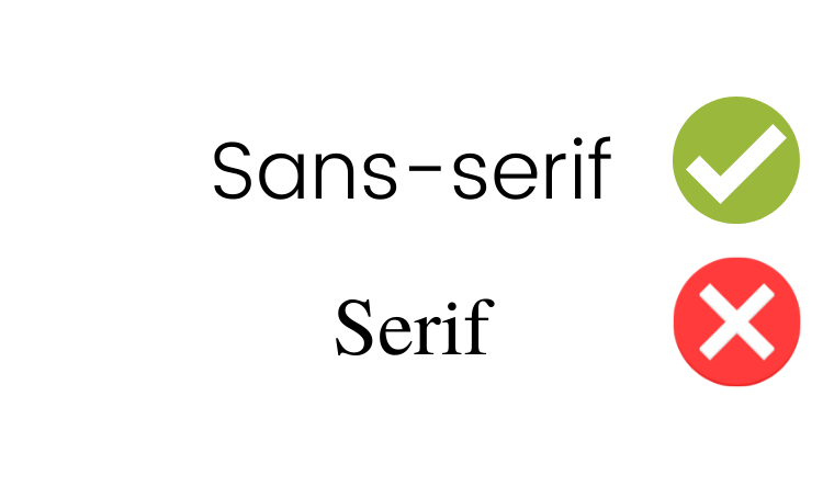
1. Fonts
Choose a text that is sans–serif. (Does not have serifs)
What is a serif?
A serif is the small extra stroke at the end of the main vertical and horizontal strokes of some letters. Some serifs are subtle, and others are more noticeable. For people with low vision, these strokes or accentuations make it challenging to read text clearly, as they can cause the individual letters of characters to run or blur together. Traditional serif fonts like Times New Roman are often used in print publications like newspapers and textbooks.
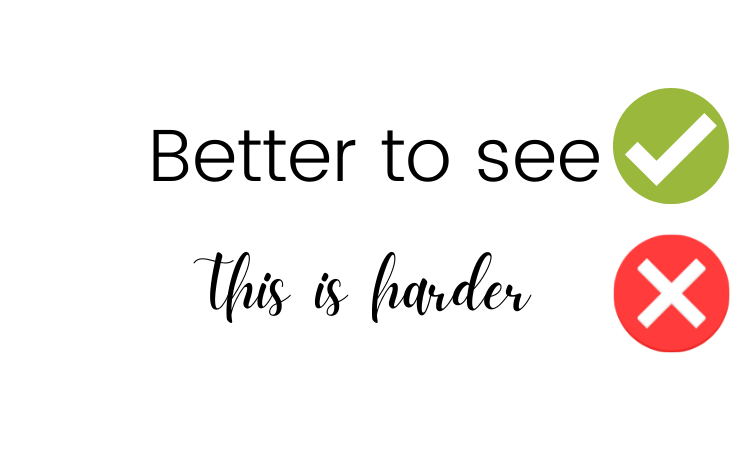
Avoid script fonts as these are also challenging to read the text clearly.
Fonts that are recommended for accessibility
- Arial
- Poppins
- Lexend
Note: Arial and Lexend are easier to read for people with dyslexia and other print disabilities!
Example
Also, consider that script texts are harder to read.
 2. Size
Font size matters. A good guide is to use at least size 14 point font for body text, with headings and titles larger in comparison. 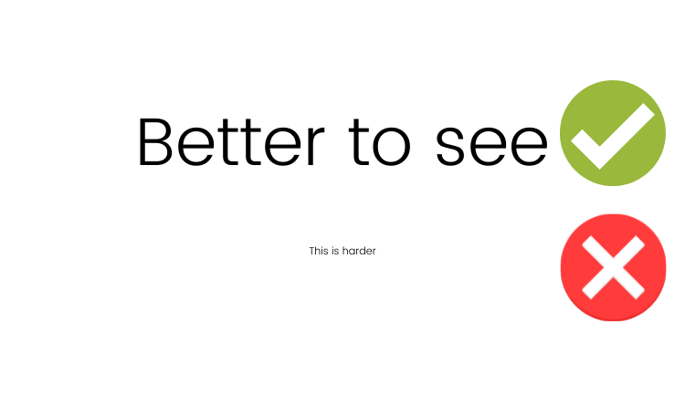
3. Contrast
Contrast is important. Consider the text colour and the background colour. If there is not enough contrast between the two (or more) colours, it can be challenging to read.
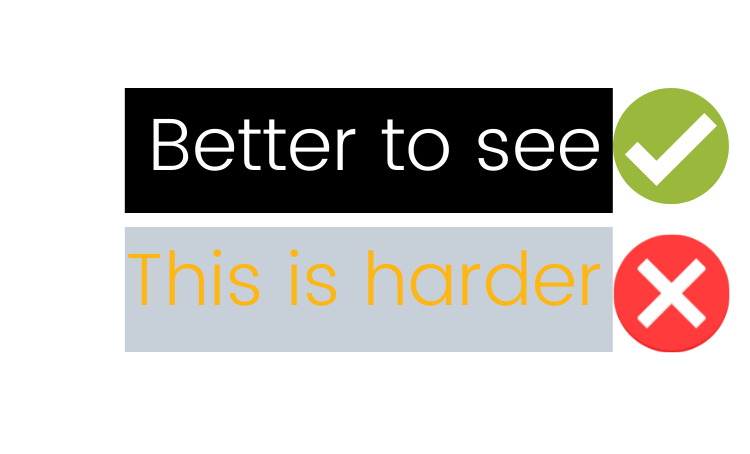
And another example of contrast.
If you would like to check contrast, WebAIM has a Contrast Checker to check if your colours pass the Web Accessibility standards.
4. Image descriptions
Image descriptions are helpful for people with low vision who consume online content, especially where a user may hear (rather than read) the document by an alternate method such as a screen reader.
An image description is a written description or explanation of an image. Add these as Alternative Text within an online image. Or as captions on the posts. A read speaker, screen reader or access feature can “speak” the image description. In some cases, it can be added above or below the image, for example, on social media. They make content more inclusive and accessible.
When you write an image description consider:
How would you describe the object and its context to someone who is blind or has low vision?
- The subject in detail
- The setting
- The actions or interactions
- Other relevant information
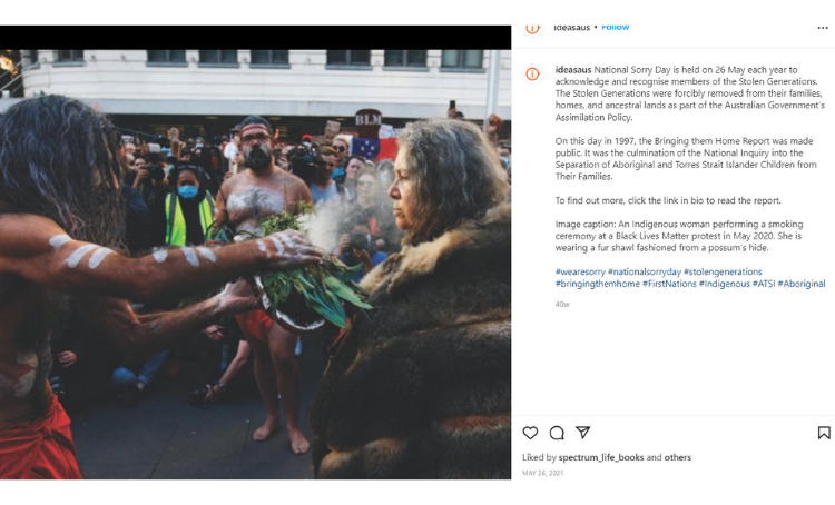
An example of Image Descriptions on Instagram.
[Image Description] An image of an Indigenous woman performing a smoking ceremony at a Black Lives Matter protest in May 2020. She is wearing a fur shawl fashioned from possum hide. An Indigenous man holds native leaves with embers inside them, making smoke. He holds this towards the woman's face. Alongside the image is text describing the image, and an explanation of National Sorry Day.
For an example of beautifully curated Image Descriptions on Social Media visit Sinead Burke. (Instagram login required)
5. Test
The best practice is to have your work user-tested by a person with low vision. Users can give you direct feedback about overall readability.
For more in-depth information and tips, visit IDEAS' article on 3 ways to make your content more inclusive.
In her work for the Melbourne Fringe Festival, Carly Findlay has developed this useful guide on Image Descriptions [slides in a PDF].
Be proactive
There are always new technologies and ways to make content more inclusive, make it part of your regular Professional Development to check what is new and available to make more inclusive content.
WCAG 2.1 guidelines
WCAG 2.1 is the global standard for web accessibility and was developed by the W3C consortium in 2018. It is a technical document and is valuable for developers, web designers and content creators.


